
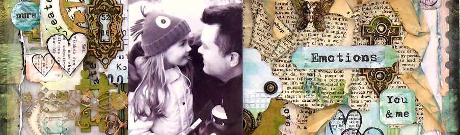
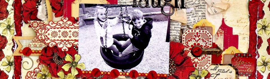

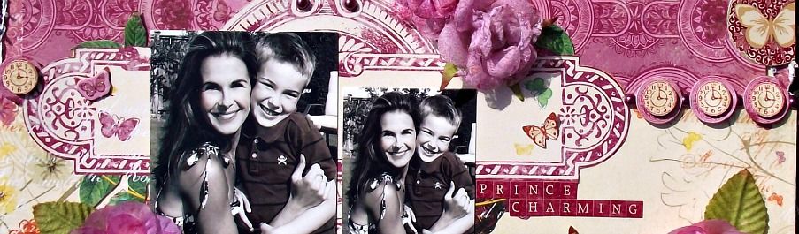
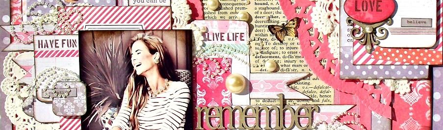
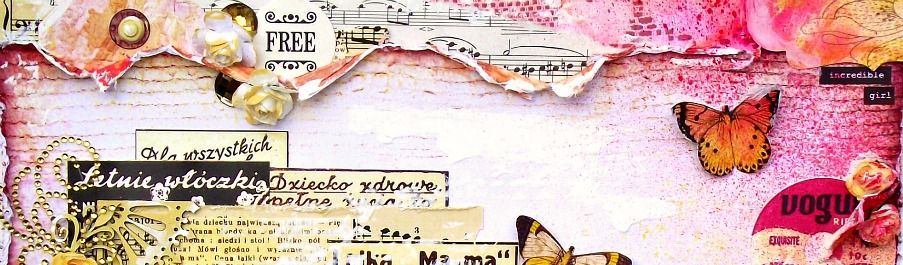
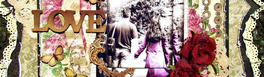
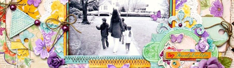
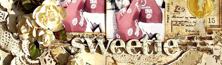

I chose a very neutral colour palette considering the amount of gorgeous, bright colours in this collection. For some reason, I was just drawn to the greens and how they stood out against the black.

I added some cream paint along the edges of my flowers as well as some of my papers for a more aged feel. There are so many little cards and tickets and little treasures to cut out from the pages of this collection - I just went wild and added in a heap of layers worth of beautiful imagery. Although, looking at this layout now, it does look a little 'flat'... perhaps a few sheets of crumpled up newsprint behind each layer would have added the perfect lift...

Thanks so much for peeking in today. I'll have lots more CHA projects coming up in the next little bit.


 Hello! Welcome to my blog. My name is Tara and I am a wife and mother to 3 beautiful children who are the heart and soul of my projects. I started scrapping in 2008 and loved it immediately. What a wonderful outlet to explore my love of crafting and photography. Thanks for stopping by.
 All content, including text, photographs and design work is









3 comments:
I think its beautiful Tara and the new papers are amazing.
Wow this looks stunning.. love the earthy colors, very country!!
I love the green, cream and black...its very fresh, but vintage, too. All the cream paint dry brushed onto the papers and flowers adds so much to the whole. It's the little details like that which make your work so outstanding. Lovely, lovely layout....
Post a Comment