
home resume subscribe contact publications design teams layouts altered art/minis cards

Monday, April 12, 2010

Loved

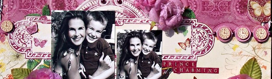
Here's a photo of my mom and dd on Easter Day. Such a happy little peanut! I was inspired by a new forum called The Color Room while completing this layout. The talent on their DT is just crazy and the amaount of inspiration in the gallery is insane - I couldn't resist. They provide a palette of colours and an optional sketch to inspire your project. The first palette was soft and gentle including white, pale yellow, pink and turquoise.

There's those gorgeous doilies again... love them so much - I actually painted this one white (it had faded).


The flowers are by Petaloo. For this project I used:

Tiffany's Treasures Jewel Centres (Topaz Gold)
Mulberry Street Value Bag (Assorted Earthtones)
Mulberry Street Mini Magnolias (Fuschsia)
Mulberry Street Mini Magnolias (Soft Yellow)
Color Me Crazy Wild Roses - Mulberry Street (White)

I cut out a bunch of flowers from an old K & Co paper pad - love mixing paper flowers with textured ones to bring a different sort of dimension to the layout.

TFL!!

Thursday, April 8, 2010

I Do Cherish You

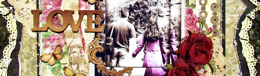
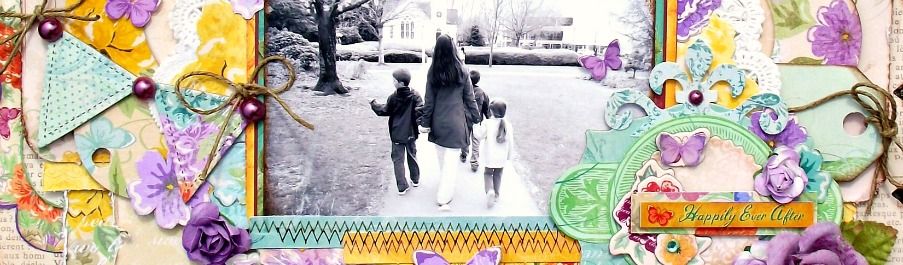
Here's a layout of my three little ones during one of our weekend strolls a few weeks back. The spring flowers were just starting to bloom but it was still quite cool outside. I'm totally in love with textures lately - as many as possible. I found a bunch of doilies at the local thrift shop awhile back and they always seem to come to the rescue when I'm searching for that special piece to complete my layout.

I tried to keep the layout soft and decided that the darker colours, although present in the photo, just didn't really work dominantly in the project. Little hints here and there in the patterned paper and the embellishments seemed to add just enough contrast.

I used Color Me Crazy Hydrangea Petals from Petaloo and they were transformed into the perfect hue with the help of some Tim Holtz Distress Ink (Walnut Stain).

The butterflies were cut out of some Jenni Bowlin patterned paper. I tried to stick with the monochromatic tone and initially thought it would be too wishy washy (hee, hee) but I think the balance of deep and soft tones still works and still enables the photo to remain the focus of the project.

Friday, April 2, 2010

Scrapbook News and Review Feature

I'm so excited!! I've had some projects kept under wrap for months now and can finally show them to you all!!

Scrapbook News and Review Magazine asked me to work with a variety of different manufacturers a few months back and to help showcase the classic 'shabby chic' style.

The March issue has just debuted and so has my feature! Click HERE to have a peek at Jenni Bowlin, GCD Studios, SEI, Karen Foster, Core'dinations and more!!

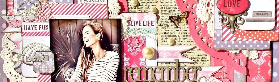
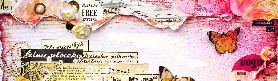
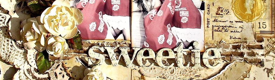
I'll leave you with a little eye candy... 1 from each manufacturer...but there's sooooo much more!!


TFL!

Blog Widget by LinkWithin