Welcome! I am so glad you could join us for the
Graphic 45 and
Want2Scrap blog hop! The hop kicks off today, August 8th and runs until August 12th, 2011.
From the Graphic 45 Team we have myself, Tara Orr and
Laura Denison participating today and from the Want2Scrap Team, the featured designer is
Elise Durenberger. Be sure to stop by each designers' blog, the
Graphic 45 Blog and Want2Scrap blog for your chance to win a bunch of amazing goodies!
Want2Scrap and
Graphic 45 will both be giving out two prizes. One prize on each of our blogs and one prize on each of our Facebook Pages. Want2Scrap will be giving out two $25 Gift Certificates and Graphic 45 will be giving out two prize packages valued over $25. For the blog prize winner, we will pick a random person who comments on one of the designers' blog posts. For the Facebook prize winner, we will pick a random person who leaves a comment on our
Facebook fanpage.
Now, on to the good stuff!! For today's project I am delighted to show you a super-shabby chic mini album created with Want2Scrap's Gate Mini Album and adorned with the elegant Curtain Call Collection from Graphic 45. In addition, I will be giving you a tutorial on how to transform your papers and embellishments into shabby chic treasures.
Shabby Chic Distressing Using a Whitewash
There are many different options to distress both your papers, photos and embellishments. I find my personal style is drawn to the shabby chic look which gives off a soft, worn look with a little bit of rustic appeal. I will offer a few tips and tricks today on a particular form of distressing - whitewashing.
Shabby Chic Style:
This style can be defined as one in which the elements give off an aged, tattered or comfy feel while maintaining its natural beauty. It often incorporates distressed and worn looking items, vintage items or heirlooms, antique tags and elements, buttons, layering (of papers and elements), muted and neutral colours, and things that seem to have a natural type of beauty.
Shabby Chic Elements:
I often include more than one of the following items: ribbon, lace, tulle, hemp, twine, burlap, cardboard, elements found in nature. In addition, photos converted to black and white or sepia often enhance the feel of this style as does stitching on your page.
Whitewash Technique:
Whitewashing is a substance used for whitening surfaces, consisting of a suspension of lime or whiting in water, often with other substances added. For my project, I decided to use the basic principal of whitewashing on my embellishments. For scrapbooking/paper crafting purposes acrylic paint (diluted or full strength) works perfectly fine to achieve that aged, shabby chic look.
I gathered all of my 'naked' chipboard pieces, metal embellishments, anything I thought I may add to my mini album and simply painted everything 'white' with acrylic paint.
Once dry, I distressed each piece even further by inking around each edge or contour with my distress ink.
The final result seemed almost 'rusted' to me which was exactly the look I was aiming for.
I then took the whitewash technique one step further. I decided, rather than distressing my project with a darker ink or torn edges, to use the white paint around the edges of my papers and other added embellishments for a softer, romantic look.
There is no rhyme or reason to the paint - sometimes the more messy and inaccurate the better it looks. Remember, your goal is to add character to your project and antique your page and embellishments.
Other Shabby Chic Techniques:
Sanding the edges of your photos, papers, alphas, etc with a piece of fine sandpaper - much like you would sand a piece of wood - until a desired, worn look is achieved.
Tearing the edges of your photos or papers
Inking the edges with distress ink. Dab your blending tool onto your ink pad and then rub in downward strokes onto the edges of your photos/embellishments/papers. I personally love Tim Holtz’ Distress Ink in “Vintage Photo”
Distressing the edges using your edge scraper. Go around the edges of your photo or papers for a worn look.
Thank you sooo much for stopping by today! Have fun and good luck!
Graphic 45 Supplies:
Curtain Call 12x12 Paper Pad
Curtain Call 8x8 Paper Pad
Metal Buttons
Metal Hinges
Metal Plates
Staples: Trim
Staples: Stickers, No.1 Sheet
Graphic 45 Packaging
Other Supplies:
Chipboard Gate Album by Want2Scrap
Chipboard "Filgrie" by Want2Scrap
Baby Bling (pearl) by Want2Scrap
Chipboard Clock, Gears, Paris Title, Fence, Swirl by Imaginarium Designs
Paris Postage and On Butterfly Wings Stamps by Hampton Art
Distress Ink in Vintage Photo by Ranger
Glossy Accents by Ranger
Film Strip Ribbon by Ranger
Adhesive Dots by ZVA Creative
Acrylic Pain in Warm White by DecoArt
Misc: Metal Clock Hands, Paper and Crochet Doilies

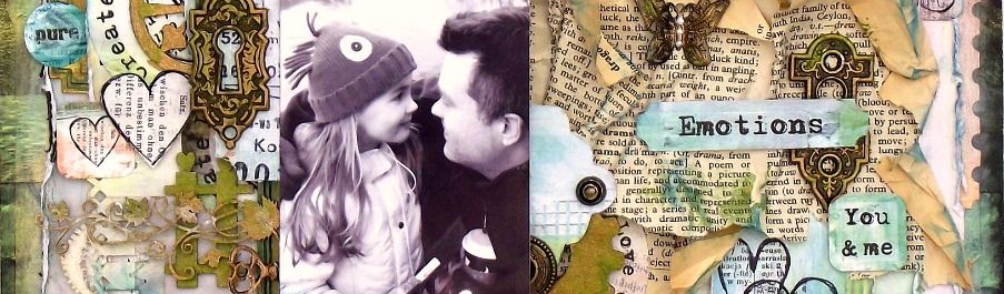



 Hello! Welcome to my blog. My name is Tara and I am a wife and mother to 3 beautiful children who are the heart and soul of my projects. I started scrapping in 2008 and loved it immediately. What a wonderful outlet to explore my love of crafting and photography. Thanks for stopping by.
 All content, including text, photographs and design work is