Hi All - I'm anxiously awaiting for my May Kit to arrive from
Scrapbook Star - think BOLD AND BRIGHT colours! And my new shipment from
Petaloo should be on my doorstep any day now - think glittery and fun! Can't WAIT!
In the meantime I thought I'd share with you a few layouts that I completed quite awhile back but am not sure I shared on my blog (forgive me if you've seen these posted elsewhere).
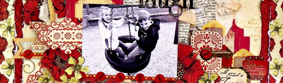
Jenni Bowlin - bless your soul. Just totally fell in love with that Red/Black Vintage line!

Lots of big patterns here and I decided to mount it all on some kraft coloured cardstock and then fussy cut out the florals. I then mounted the entire project on kraft cardstock as the background piece.


Lots of fussy cutting here - I outlined everything in black so it would stand out a little better.

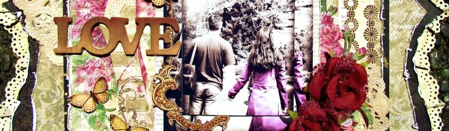
Fell in love with this photo of my dd in her raincoat. Lots of stuff going on in this project, but I think everything still ties in well without any one piece overpowering another. Balance is definately key when you have bold colours and bold patterns.

Some more fussy cutting and a little glossy accents to help the branches stand out a little better.

Of course the flowers are
Petaloo - Color Me Crazy collection which I inked to match the deep reds in the patterned paper. Added a little of my own bling, some doodling and voila!


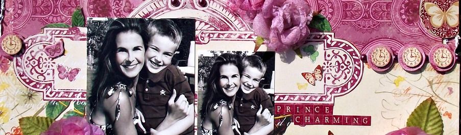
I tried to keep everything dainty and delicate with this layout. All the little touches here and there make a big difference overall.

You've seen this posted before - here are the close ups as well!

LOVE fussy cutting! A little bling, some calendar cards and you're good to go!

The most perfect, delicate, felt butterflies around!

Wasn't sure if adding black to these papers would work, but by tying in a black title and metal frame, I think it balances out okay in the end??

Some glimmer mist to complete the slightly grungy edge.

You can see the dimension on the frame now - is super heavy actually - looks a lot better in real life!

Here are the 'blue' butterflies that I inked and coated in glitter glue.

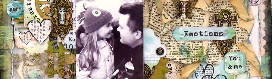

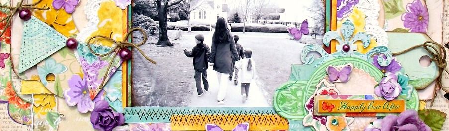
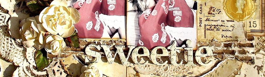
 Loved this Artsy Urban collection by GCD. Amazing colours and patterns.

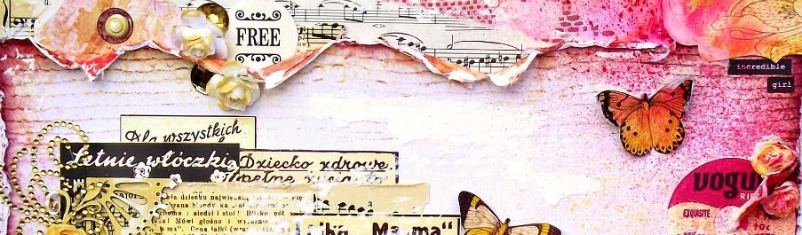
 Core'dinations' whitewash cardstock was so neat - when you distress it, it reveals the second colour.
 Just a simple, silly layout with my mom and I. This paper was so gorgeous! Perfectly textured and the bold hue was so elegant that I didn't do much to embellish - a few stickles and some butterflies added just the right amount of bling!

 You've seen this posted before - here are the close ups.

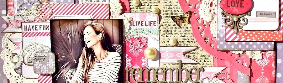
 Just a simple 12 inch circle doily that I purchased at the dollar store ($1.00 for a package of 6) and painted black.


 Hello! Welcome to my blog. My name is Tara and I am a wife and mother to 3 beautiful children who are the heart and soul of my projects. I started scrapping in 2008 and loved it immediately. What a wonderful outlet to explore my love of crafting and photography. Thanks for stopping by.
 All content, including text, photographs and design work is